
From Code 111 to Blood Heaven: A Demonstration of Brand Evolution
- Jan 5
- 4 min read
Updated: Apr 4
Reimagining Streetwear through the Lens of Escapism
Once Code 111, its vision was originally rooted in street apparel. It embraced authenticity and grit, embodying what the founder, Jeffrey Matlock, once stood for. This was reflected in the clothes with muted tones, washed textures, and rugged graphics. Matlock now wanted to pivot his brand towards a vision that appealed more to him personally. He was expecting a change that was drastic enough for a new name, this being Blood Heaven. His goal was to capture the essence of escapism; for him, his escape was raving. The goal was to elaborate on the already established themes of authenticity and grit, and push their definitions to show that there should be lesser degrees of societal shame when engaging in escapism. Jeffrey has mentioned how raving stands as an accepting and safe space for ultimate self-expression. Many people with different backgrounds and experiences come together in solidarity to immerse themselves in the music. He shared with me an alternative perspective on this lifestyle, demonstrating that someone with a more “normative” routine could involve themselves in rave culture just as deeply as anyone else, without needing to abandon their everyday identity. While I don't believe that there is one "normative" routine, I still feel that one's daily life can be stressful and unfulfilling at points, no matter their background. Raving creates an immersive environment for one to escape from the realities of everyday life. As ambitions as it was to capture these perspectives and values of authenticity and escapism, Jeffrey showed me with an outline of a campaign that attempted to encapsulate these ideas.
We treated the campaign like something that could grow over time instead of dropping everything at once. It started with a short video to introduce the new direction of Blood Heaven and set the overall mood. From there, we moved into a photoshoot to give the clothing a more grounded presence. Once the video started gaining traction, we focused on short-form content to keep things moving and stay active on social platforms. Later on, we wrapped things up with a fall short film and another round of photos and content. This gave us the chance to push the ideas a bit further while keeping everything connected. Throughout the process, Feel The Music stayed at the center of every decision and helped everything feel cohesive instead of scattered.
Warehouse Visuals: Capturing Grit in The Studio Studio
For the first portion of our campaign, I was invited to direct one of several photo shoots on set, and edit the final video which became, “Feel The Music”. This was the launch of the campaign, demonstrating the identity of Blood Heaven and it was up to the visual effects to tie together the themes of the project in order to deliver on this project.
On set, I was able to direct a photoshoot which took place inside a warehouse studio. Since we were uncertain about the specific requirements of the studio, we selected some readily available props and constructed a scene that allowed the clothes to showcase their intended environments. The next day, I imported the photos into Lightroom and made enhancements to make the scenes more vibrant and captivating.


Drawing from a previous project I had, which were some visuals for a beat pack I had made the week before, there were visual effects with I wanted to adopt into Feel The Music. I felt that the rapidly changing graphics, the stuttered laptop spinning, and flashing text effects were a great fit for the project, as it could reflect the “underground rave” theme we were going for in our marketing materials.
Maintaining the Momentum: The Short-Form Series
Seeing the traction that this video produced for Blood Heaven, we wanted to keep the momentum going through short form content. We wanted to dedicate a day to make a variety of content over several locations in Los Angeles. What we walked out with were whimsical, high energy videos that felt playful, allowing us to extend the sense of escapism in short formats.
Phase Three: Wrapping the Campaign with Narrative Film
As the final deliverable of this campaign, we wrapped things up similar to how we started with another short film. Jeffrey came to me with a concept already in mind, having another spirited video where an owner loses his cat, only to find the cat at a runway show. I thought the concept was straight forward and perfect for a single location, which was CSULB. With the help of @framesbyrich for the animated cat found in the video, and a song produced by @lentebloom, we were able to make a short film that captured all the themes of Blood Heaven.
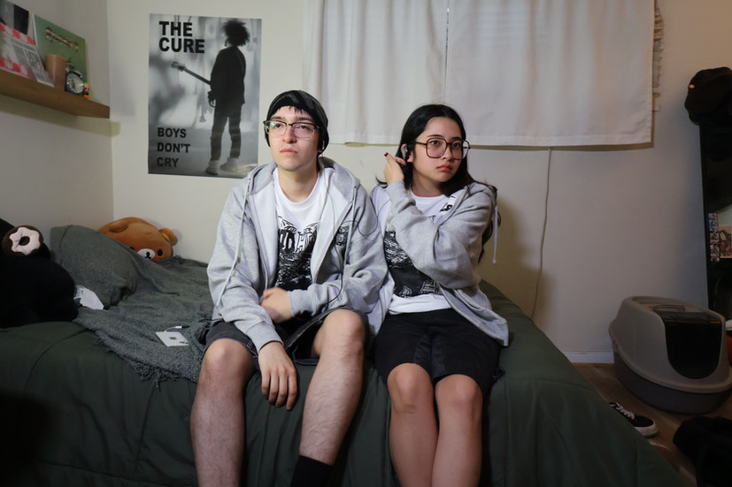
A couple of weeks following our launch, Jeffrey invited my girlfriend, @lindseyvillacorte and me to model for a photoshoot directed by him and @lilindrde. It's rare for me to be on the other side of the lens and this a nice change of pace. Here's how those photos turned out.


Reflection
This campaign gave me the opportunity to explore fashion marketing beyond simply showcasing clothing, and instead focus on building an experience around it. Working with Jeffrey felt natural in the best way there was trust that made collaboration feel easy and allowed ideas to develop organically. Because the themes of self-expression, escapism, and authenticity were things I genuinely connected with, it was easier to keep everything cohesive across different deliverables, from short films to photography and short form content. Having that shared vision made the campaign feel intentional and unified, rather than just a collection of promotional pieces.


